

Pleres Midstream Group: a brand built to hold up in the field.
Pleres Midstream Group processes natural gas from Edmond, Oklahoma, and its brand lives on trailers, skids, hard hats, and site signage long before anyone opens a website. Atemp Co. led the design, from three styleframe directions to a finished manual. HMM ran the project, shaped the strategy, and built the collateral that put the new identity to work.
- Pleres Midstream Group, Edmond, OK
- Natural gas processing (midstream)
- Atemp Co.
- Project management, design consulting, strategy, collateral
Three creative directions
creative directions presented as styleframes before a logo was drawn
Six logo lockups
logo lockups, from the bare mark to the endorsed line for group companies
Twenty-nine page brand manual
pages in the brand manual, including what not to do
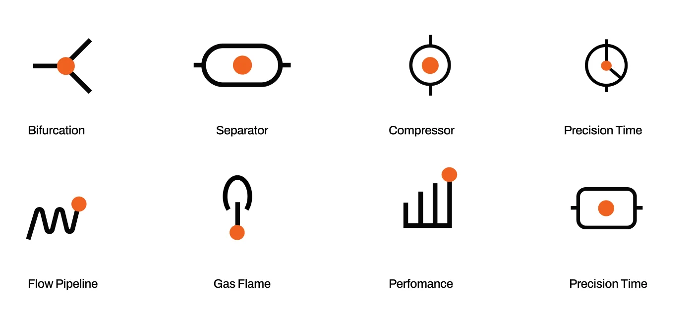
Eight process icons
process icons, each with one orange dot marking where value is generated
Who did what on this project?
Two firms, one system. The design belongs to Atemp Co. The management, strategy, and collateral belong to HMM. The brand belongs to Pleres.
Atemp Co.
Design studio based in Brazil, and the studio behind HMM’s own rebrand.
- Brand strategy, narrative, and creative direction
- Logo, brand mark, and six lockups
- Color system, typography, and hierarchy
- Graphic element, textures, and iconography
- Photographic style and application mockups
- The 29-page brand manual
Hammonds Media & Marketing
Norman, Oklahoma. Accountable to Pleres for the outcome and the timeline.
- Project management across client, studio, and vendors
- Design consulting through every review round
- Marketing strategy: carrying the system into digital channels
- Collateral: LinkedIn banners, two caps, and a field vest
Who is Pleres, and why did the brand have to work this hard?
Pleres Midstream Group is a mid-tier natural gas processor headquartered in Edmond, Oklahoma, with initial operations in the Permian Basin. Midstream is the stretch of the energy business between the wellhead and the end user, and Pleres works a narrow slice of it: the interval between an operator’s separator and the market, where associated gas is flared, vented, or under-monetized. The name is Greek for “whole, lacking nothing.” The group operates through companies such as Pleres Midstream, each of which needed to carry the parent brand without being mistaken for it.
The brand manual states the philosophy in the company’s own words: every decision is made with the awareness that lost gas is lost value, and that speed without method is risk, not efficiency. The identity had to say that on a trailer door at highway speed and on a business card across a table, and it had to be ready as the group marked its tenth year.
The brief itself was a tension. Ty Mote, CEO, a former Microsoft strategist with a marketing background, wanted abstraction, minimalism, and depth. Marty Summers, COO, with oilfield roots, wanted immediate recognition, weight, and closeness to the field. Atemp Co. treated that as strategic data rather than an obstacle, and reduced it to one design principle: familiar from afar, revelatory up close.
“Pleres Group is a natural gas processing company designed for open minded and forward thinking clients. We work with people who understand the value of grit and building trust to deliver the competence and credibility that makes clients feel relieved and heard throughout the challenges of implementing tech & innovation towards efficiency, sustainability and profitability.”
Two founders, opposite instincts
Depth for the one who looks closely, recognition for the one who arrives from a distance. Both had to be true in the same mark, or the brand would betray one of its owners.
A group and its companies
One mark had to work as the parent brand, as Pleres Midstream with a descriptor, and as the endorsement line “A Pleres Group Company” on subsidiary materials.
Legible from across a yard
The brand shows up on vehicles, equipment, open fields, and hard hats. Anything fussy would disappear at that distance, in that light, under that grime.
Built to be handed off
Sign shops, embroiderers, and web developers would all touch this brand without a designer in the room. The system had to be specific enough that they could not get it wrong.
How did the project run?
Three stages, in the order Atemp Co. laid them out on the first slide of the identity presentation. HMM kept all three on one calendar.
Immersion and concepts
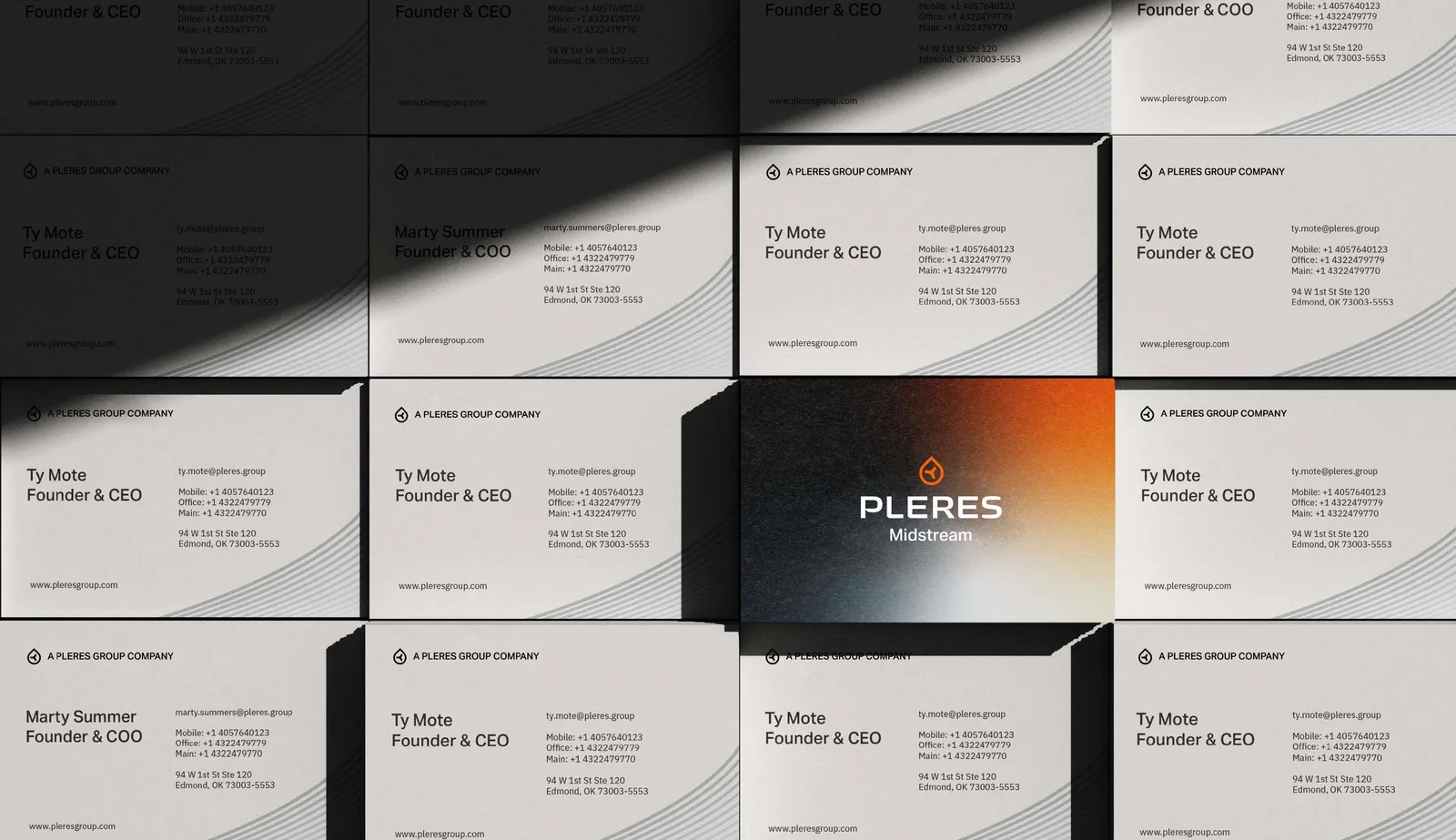
A brand core statement, a set of attribute sliders to pin down the personality, and three styleframe directions, each carried through to a working business card so the Pleres team could judge a real object rather than a mood board. Pleres chose Flux.
Development and design
Two weeks after the styleframes, the full system: the bifurcation concept, the symbol, the wordmark, the lockups, colors, typography, iconography, graphic elements, image direction, and a first set of applications, presented as one deck and reviewed round by round.
Material and guidelines
The 29-page brand manual, master files for every lockup and color variant, patterns, textures, icons, and mockups. Then HMM’s collateral, built from the manual as its first outside test.
What kind of brand did Pleres want to be?
Before a single sketch, Atemp Co. and the Pleres team placed the brand on seven scales. The readings below are the ones the team settled on, and they explain most of what came next: a minimalist, senior, premium identity that leans abstract.
- Ornate / traditionalMinimalist / contemporary
- Organic / roundedGeometric / angular
- FeminineMasculine
- YoungSenior
- LuxuriousBudget-friendly
- ClassicModern
- Literal / representationalSubtle and abstract
Three directions, one decision
Each styleframe came with a premise, a palette, a typographic attitude, and a business card prototype. Scroll through them in the order they were presented.
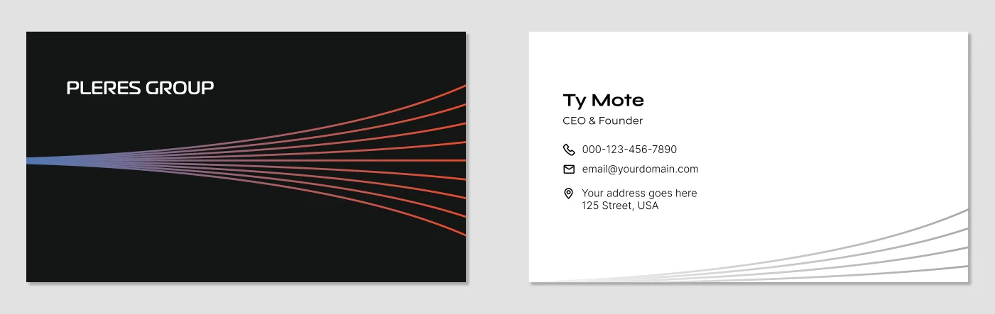
Flux
Pleres as a brand that exists in the transition from raw to usable. Where innovation lies. The flowing in-between.
- The process
- Open, directional
- Flow
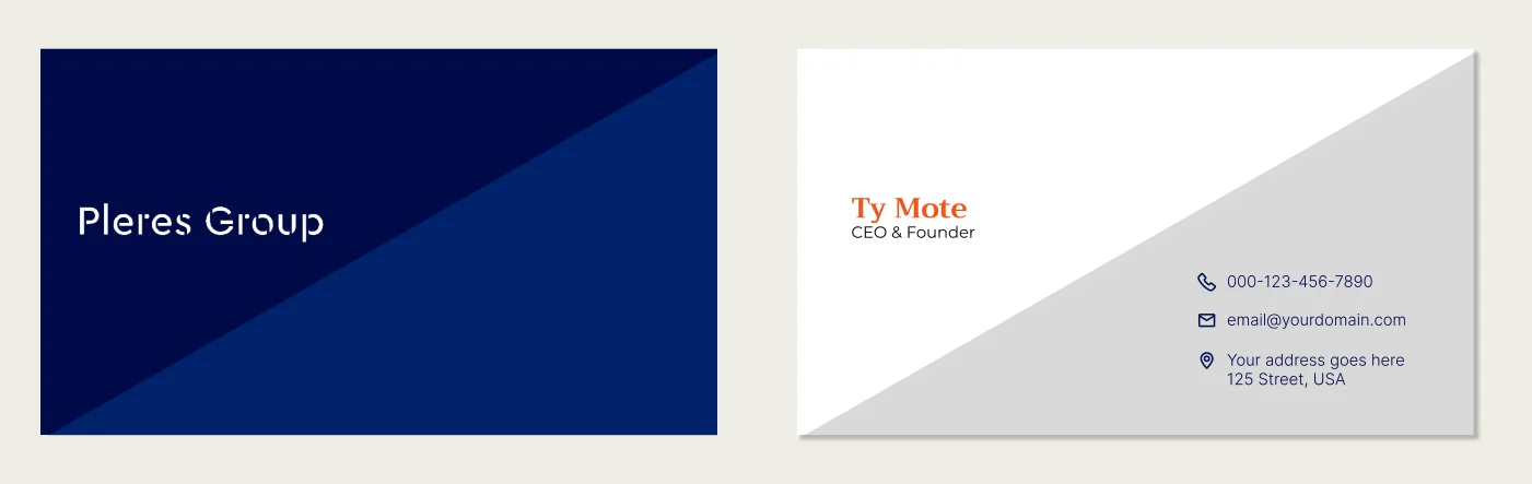
Two Worlds
Diagnosis and prescription. Action and reaction. Objectives and results. Vision 02 looks at the extremes, the absolute commitment that Pleres provides in everything, everywhere, every time.
- The two states
- Nested, dual
- Resolved tension
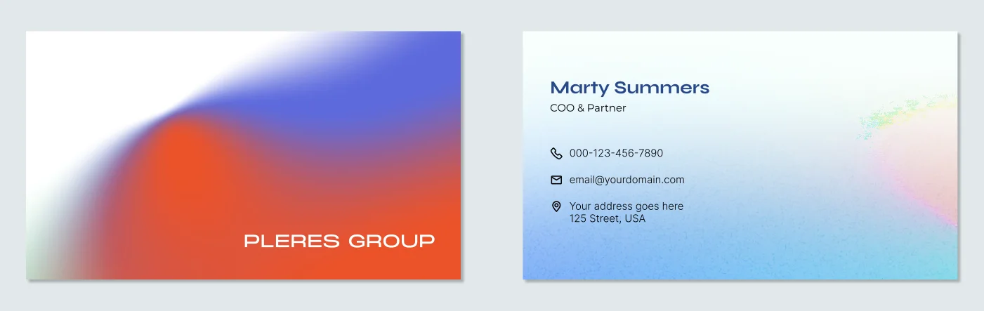
Engineering the Invisible
Pleres understands and finds value in the intangible, where all hear but do not listen, where all can see but do not perceive.
- The invisible result
- Space as protagonist
- Lightness and control
Pleres chose Flux: the brand that lives in the transition from raw to usable.
Open and directional, with flow as the feeling. It matched the sliders, it matched the core statement, and it gave the studio a single idea to build a symbol around. That idea turned out to be a fork in a line, and the next section shows where it came from.
Why is the Pleres mark a bifurcation?
A bifurcation is the point where one path becomes two. Atemp Co. went looking for it in the world before drawing it, found the same shape in three places, and then found it four more times inside the business itself.

It represents a point of tension, where precise force on the correct region can create an effective chain-of-reaction. 
It is the point where resources are distributed to pertinent partitions of organisms and structures. 
It is the starting point where light can be dissected into an entire spectrum of colors and properties.
“In every complex system, the bifurcation point is the moment of highest potential: when one becomes more.”
Atemp Co., visual identity presentation, April 2026
Where the business already bifurcates
The studio’s article on the project makes the case that the concept was not imposed from outside. It names four decision points that already existed in how Pleres operates.
Gas arrives from the operator’s separator. Pleres decides: on-site processing or gathering for deep recovery. The physical flow splits before the technical process begins.
After recovery, natural gas liquids go one of two ways: sold as pure product at market pricing, or blended back to crude. The same product, two economies.
When the residue line is the constraint, the leftover gas still has a path: emissions reduction before flaring, a residual gas buyer, or on-site power. Waste splits into value.
Processing fee or revenue share. The same service, two risk-and-return structures, and the operator chooses the path that serves their operation.
Five pillars. One law.
With the law set (bifurcation multiplies the paths), Atemp Co. held every pillar of the brand narrative to it. In the studio’s words, if an element contradicts the law, it is wrong.
- Reveal the asset the producer already had.
- Inhabit the interval no one operated with precision.
- The producer did not know they already had a second revenue stream.
- Arrives with evidence before argument.
- Case after case, the same revelation.

A single mark holds both principles.
- Three paths departing from one point.
- An arc that surrounds them, incomplete by design, in permanent motion.
“What divides doesn’t disappear. It enters a cycle.”

The bifurcation is not only in the mark. It is hidden in the name.
A vertical stem meets a curve, and splits. In the studio’s words: those who look see letters. Those who look closely find the system.
Why the open arc became a drop.

The founders made the call. In the studio’s account, the drop was a concession to immediate recognition, Marty’s voice speaking louder: the material the company processes, legible at a glance on a hard hat. The concession did not erase the concept. It wrapped it inside the matter. The drop is the entry point, and the bifurcation keeps happening inside it. The headline typeface also moved, from Aktiv Grotesk to Hanken Grotesk, between the reveal and the manual.
“We translated a complex problem into a powerful idea and a powerful idea into an identity that carries that force across every touchpoint.”
What is inside the Pleres brand system?
Five layers as they appear in the final manual, each one designed by Atemp Co. and reviewed round by round with HMM and the Pleres team. Scroll through them in order; each one inherits from the one before it.
A drop, with a junction inside it.
The drop is the entry point: the material the company processes, recognizable in the field at a glance. Inside it, the bifurcation keeps happening, three paths from one point, a flow that divides and multiplies within the very product Pleres transforms.
Six lockups cover every situation: horizontal and stacked, each with or without the Midstream descriptor, the bare mark for hard hats and app icons, and the endorsed line “A Pleres Group Company” for subsidiaries. The manual sets clear space, minimum sizes, and a page of things never to do.

Two forces. One palette.
Orange Heat, which the deck calls the moment of transformation, for energy, movement, and intensity. Cold Blue for trust, technology, and stability. The manual names four approved pairings and gives each a job: black and white for classic balance, orange and blue for energy and trust, black and orange for contrast and for the professional, technical register.
Two ramps of secondary tones and a seven-step neutral ramp give the brand depth without a color outside the palette. The textures are the only gradients allowed, in these two directions only, and never over a photograph.


No serifs. No ornament. No apology.
Hanken Grotesk carries the headlines. The manual calls it the brand’s voice when it needs to be heard from a distance: on facades, vehicles, open fields. Legible in the dark. Recognizable from afar. IBM Plex Sans, lighter and more technical, carries the supporting text, built for complex systems and here for making the dense accessible.
The hierarchy is written as the brand speaking. Display: “Energy that doesn’t escape. Value that doesn’t waste.” H1: “Natural gas processing with precision, speed, and backbone.” H2: “Technology that works. People who deliver.” Labels: Processing, Separation, Transport, Recovered value.
Icons are instruction.
Each symbol carries the logic of a step, from gas flux to processing plant, from separation to output: bifurcation, separator, compressor, flow pipeline, gas flame, performance, precision time. The system follows operational reasoning with the same precision the operation demands.
The orange dot is the state marker: where energy is present, where the system is active, where value is being generated. The manual builds the set from the IBM Carbon and Phosphor libraries under three rules: simplicity with purpose, consistent geometry, focus and contrast.
Curved lines that move in one direction.
The graphic element is a set of curved, parallel lines with consistent spacing that sweep across a surface and converge, like flow through a pipe. It descends directly from the Flux styleframe card, where a fan of lines was the whole idea.
It comes in orange, blue, and graphite, may be used as a mask, and is always a supporting element: subtle, functional, never the main event. On the business cards it runs along the bottom edge in a low-contrast gray, exactly as the manual prescribes.
The palette, computed rather than eyeballed
Six of the seventeen colors, with the role each plays. Every text pairing on this page was checked against WCAG AA, the accessibility standard for legible color. That check is why the primary orange never carries small text on a light background here. The swatches copy their hex value when selected.
What does a Pleres photograph look like?
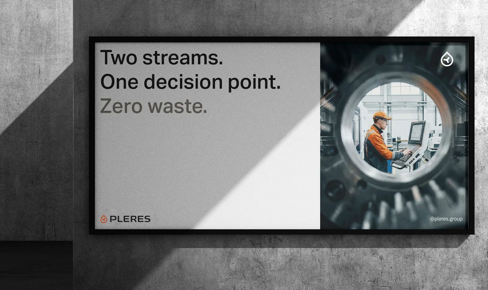
Open field at dusk. Pipelines against the sky. A technician seen through the gear, framed by the very equipment being operated. The deck puts it plainly: no studio, no abstraction. The work environment is the stage, and it already carries everything the brand needs to say: scale, grit, competence. The operator with the logo on the hard hat is not aesthetics. It is evidence.
Recognizable environment. Field, plant, equipment.
Light with character. Dusk, industrial blue, natural contrast.
Human presence. Not as subject, but as part of the system.

What does the brand look like on the things Pleres actually owns?
Atemp Co. mocked the system onto the surfaces that matter in this business. Trailers, skids, a facade, a stage. Not tote bags. Select any piece to see it larger.
Facade signage: the mark and wordmark at building scale, in black on white. Trailer livery: the wordmark at road scale with the tagline Precision midstream. Equipment: the orange is not decoration on a skid, it is the paint spec. Uniform and hard hat: the mark reads at arm's length, the wordmark at a handshake. Container: the mark alone, at the size where a wordmark would break. Stationery: black stock, one orange mark, nothing else competing. Screens: photography on the phone, the blue texture on the tablet. Stage backdrop: the texture, the headline voice, and four process icons in one frame.
What did HMM actually do on this project?
The unglamorous work that decides whether a brand project ships on time and lands in the field intact. Four jobs, in the order they mattered.
Project management
One timeline across the Pleres leadership team, the Atemp Co. studio, and the vendors downstream. HMM ran the review rounds, consolidated feedback into single decisions, and kept a studio in Brazil and a client in Oklahoma moving as one team.
Design consulting
Translating field reality into design constraints. What has to survive on a skid, embroider cleanly on a cap, and read on a trailer door. Those constraints shaped the minimum sizes, the color restrictions, and the bare-mark lockup.
Strategy
How the system carries into marketing once it leaves the manual, with digital first: which lockup and texture belong on LinkedIn, on the website, in search results, and in campaign creative, and which headline voice each one uses, so a post, a landing page, and a trade show backdrop read as the same company. The two LinkedIn banners were the first proof of that plan.
Collateral
Two LinkedIn banners, a tenth-anniversary cap, a Pleres Midstream cap, and a field vest, all built from the finished manual without redrawing a single element. That is the test of a brand system, and it passed.
The collateral, ready for the tenth year
Produced by HMM from the Atemp Co. system. Scroll sideways to see all five.
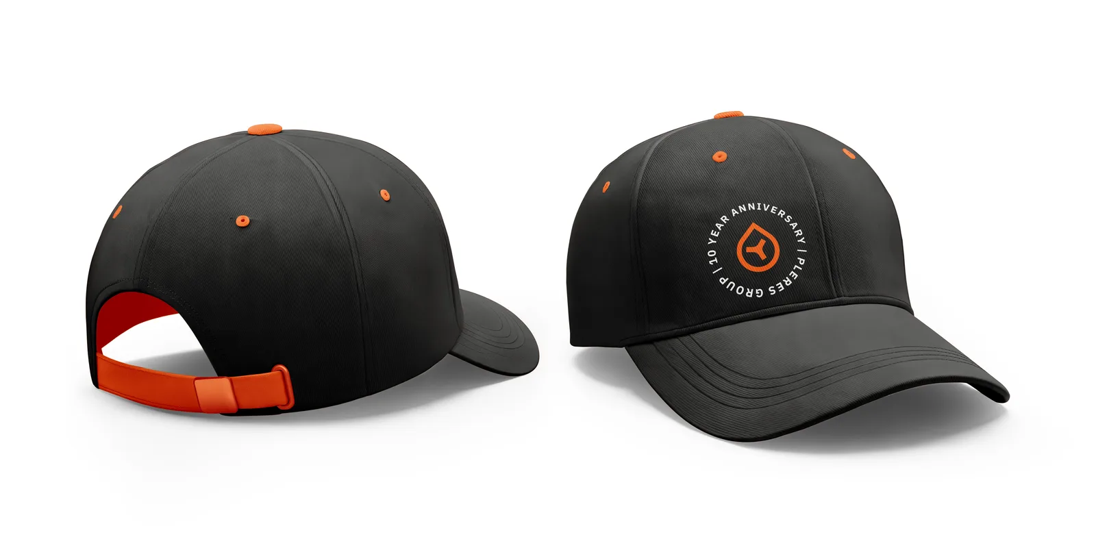
Ten-year anniversary cap 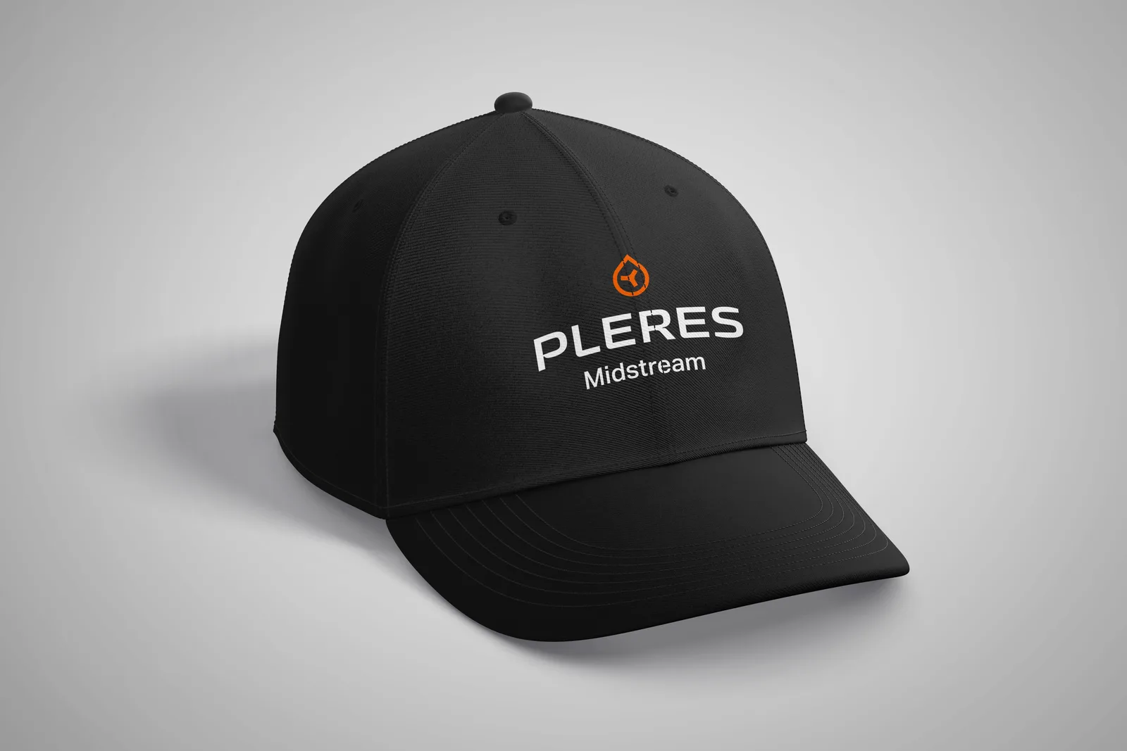
Pleres Midstream cap 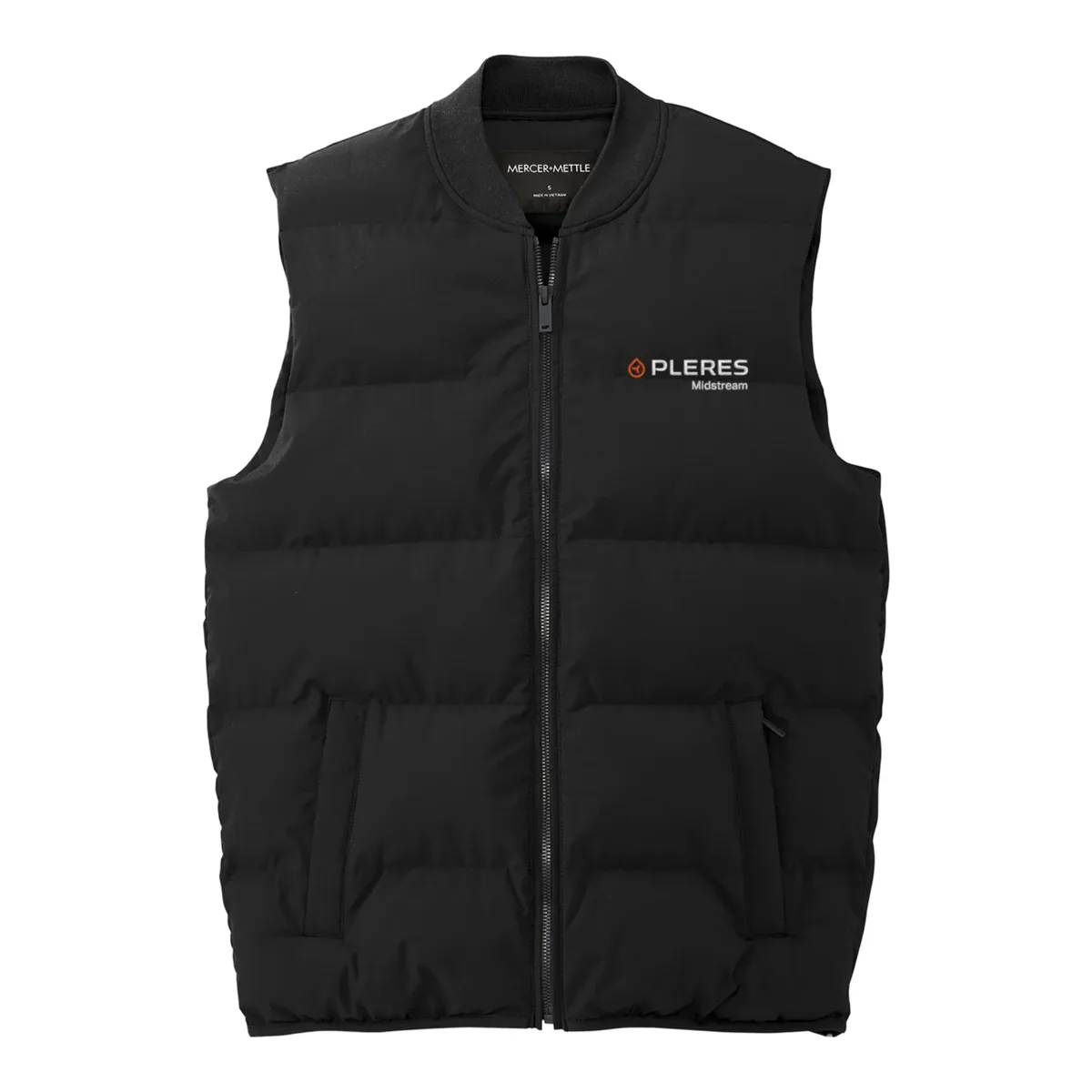
Field vest 
LinkedIn banner, Cold Blue 
LinkedIn banner, Orange Heat
What did Pleres walk away with?
A complete identity, the reasoning behind it, and the means to use it without calling a designer: the discovery and identity presentations, master logo files in every lockup and color variant, the graphic element and textures, an icon library, photographic direction, a set of application mockups, the brand manual that governs all of it, and a first run of collateral for the group’s tenth year. The system was also built to grow by the same principle it describes: the core identity is immutable, and what is on the hard hat on day one will still be there in five years, while new elements can be added as the company reaches new basins, markets, and models. The live site at pleres.group now wears the system.

“Garrett and the team were fantastic. They understood my needs as a business and now I wanted to communicate my brand. The structured discovery and development process was helpful to my team and I am grateful for their support. Most of all, I am very proud of the brand kit we developed.”
What do people ask about projects like this?
Who designed the Pleres Midstream Group brand?
Atemp Co., a design studio based in Brazil, was the lead designer. Atemp Co. handled the brand strategy and narrative, brand research, the logo and its lockups, the color system, typography, the graphic element, textures, iconography, photographic direction, and the brand manual. HMM managed the project, consulted on design decisions, set the marketing strategy for carrying the system into digital channels, and produced the collateral built from the finished system.
Does HMM design brands in-house or with partners?
Both, depending on the project. For identity work at this depth HMM partners with specialist studios and stays accountable for the outcome: the timeline, the reviews, the marketing strategy that puts the system to work, and everything produced once the identity exists. Atemp Co. also designed HMM's own rebrand, so the working relationship predates this project.
What is a styleframe in a branding project?
A styleframe is a concentrated preview of one creative direction: a mood board, a palette, a typographic attitude, and usually one real application such as a business card, presented before any logo is drawn. Atemp Co. showed Pleres three of them (Flux, Two Worlds, and Engineering the Invisible) so the decision about direction happened early and cheaply, before the expensive work of building a full system.
What is in a brand manual, and why does a company need one?
A brand manual, sometimes called a brand book or style guide, is the rulebook for how a company looks: logo versions and clear space, minimum sizes, color values for print and screen, typefaces and hierarchy, graphic elements, photography direction, and examples of what not to do. It exists so a sign shop in one town and a web developer in another produce the same brand without a designer standing over them.
Can HMM produce collateral from a brand guide another studio made?
Yes. That is exactly what happened here. HMM built LinkedIn banners, two hats, and a vest from the Pleres brand manual without redrawing a single element, because the manual specified everything needed to do it correctly. A good brand system is meant to be handed off.
See how a brand system carries into a website in the Fremantle Lake case study, or browse the rest of the case studies.
A note on how this page was made
AI tools helped draft some of the writing on this page. All of the content was written or reviewed by the HMM team before publication. Brand design and mockups are the work of Atemp Co.; the palette, typography, and usage rules quoted here come from the Pleres brand manual.